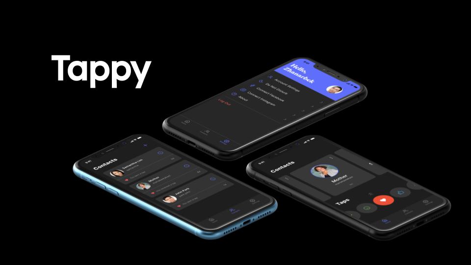
JunctionX - Tappy

Introduction
One core thing that technology has given us is the ability to communicate at any time or place with each other. In large part due to this convenience, more and more conversations are moving into apps and tech and there is less and less for face-to-face conversations. Especially in the midst of a pandemic like COVID-19, it’s necessary for the sake of one’s health to move social interactions online. However, even though the technology has improved, our needs as humans haven’t. Online conversations not only limit the channel of communication to a mostly textual one, but they elevate information over emotion. We’re losing a lot of the human element. And the longer that quarantine goes on, we realize that the more we speak, the less and less we feel connected. At the end of the day, do we spend time with our friends and family because we want to communicate with them, or simply because we remember the comfort we feel when around them?
But just as technology has been able to make one aspect of communication more efficient, we can use technology to bring back the other human elements of communication. To do this we want to open up other channels of communication. We are targeting that gap in the way that people interact with each other - the idea of “presence”, of always being connected with people that you care about. Our app hopes the recapture that feeling through the technology that’s already available to us.
How it works?
In essence, we are taking something that’s a small part of other messaging systems and centralizing its role in the way we interact with each other - emoticons. We wanted it so that it was possible to express just simple units of emotions such as happiness or gratitude or relief, and share those moments with others. This awareness of these shared moments is something reminiscent of the feeling of having someone next to you and feeling comfort in that awareness.
Although fundamentally the app might seem simple, we want to take significant measures to shape the kinds of interactions that occur on our system. We want people to engage with the app without any sense of obligation or pressure. With other social media apps, it’s impossible to just send a simple “hi” or an emoji without both sides feeling the pressure to engage in conversation. Instead, when someone uses our app we want them to just simply share with the other person that you were thinking about them. All the emoticons that can be sent are chosen to express positive, prosocial feelings while remaining subtle in design. This also helps people of certain cultures who may be uncomfortable with more overt displays of emotion, express how they feel. It validates their experience as valid.
Apart from the emotional aspect, we also had implementation details to consider. We wanted all our functionality to be incredibly simple to understand and use. When you open the app, you immediately see a list of your contacts at the top and the emojis that you can send at the bottom. Then it’s just a matter of selecting the recipient, choosing the emoji, then sending it off to him. The minimalism is deliberate. We don’t want this to become another social media app where one might feel obligated to engage in conversation or trade emojis out of politeness. If our app has anything, it’s the feeling of authenticity and spontaneity and temporality. Experiencing the moment as it is. The color palette was chosen for it’s muted tones. It’s meant to appear approachable and gentle.
To add other users, we allow the user to send an invitation through another messaging app for the sake of ease of use, but once that has been done they can communicate through the app. This app isn’t meant to replace traditional conversation, but supplement that context surrounding it.
Technology behind it
Backend is deployed as a Node.js + Express app on Azure. We will also be using Cosmo DB on Azure for its MongoDB instance. Azure allows us to handle all kinds of different kinds of traffic in a very scalable and easily manageable way. It also has high uptime and good geographic distribution making it an ideal solution for an app meant to bring distant people together.
Presentation at JunctionX Asia
Future plans
We were able to get a basic, single user prototype working with this app and clarify the foundational design work. Since this app is significantly dependent on design, any more effort that we put into design will go a long way. This includes animations associated with the emojis as well as theming capabilities. There is also a lot of additional functionality that we intend to add such as greater native integration with IOS and Android so that we have greater control over push notifications, some basic chat functionality, and perhaps some statistics and other incentives to encourage use.