Data visualization on a globe, inspired by Github's homepage

Inspiration
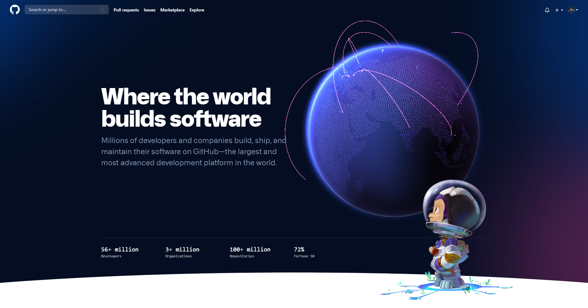
If you visited Github's homepage recently, you probably seen their new, re-designed landing page. It is incredibly well-made. One thing that stands out is the globe, where they display recent pull request activity on Github. It is fascinating to see 3D becoming more and more popular in web design.

I wanted to re-create it.
three-globe
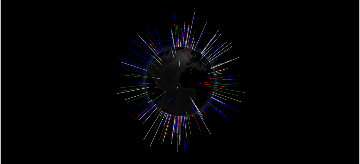
Doing a pandemic simulation in ThreeJS from scratch really helped me to familiarize myself with ThreeJS concepts. At first, I did not have any idea where to start. Luckily, I found a package named three-globe that allows users to display data on a globe. It had a pretty well-written documentation too. However, it was ugly and nowhere near to the globe design made by Github.

Creating an environment
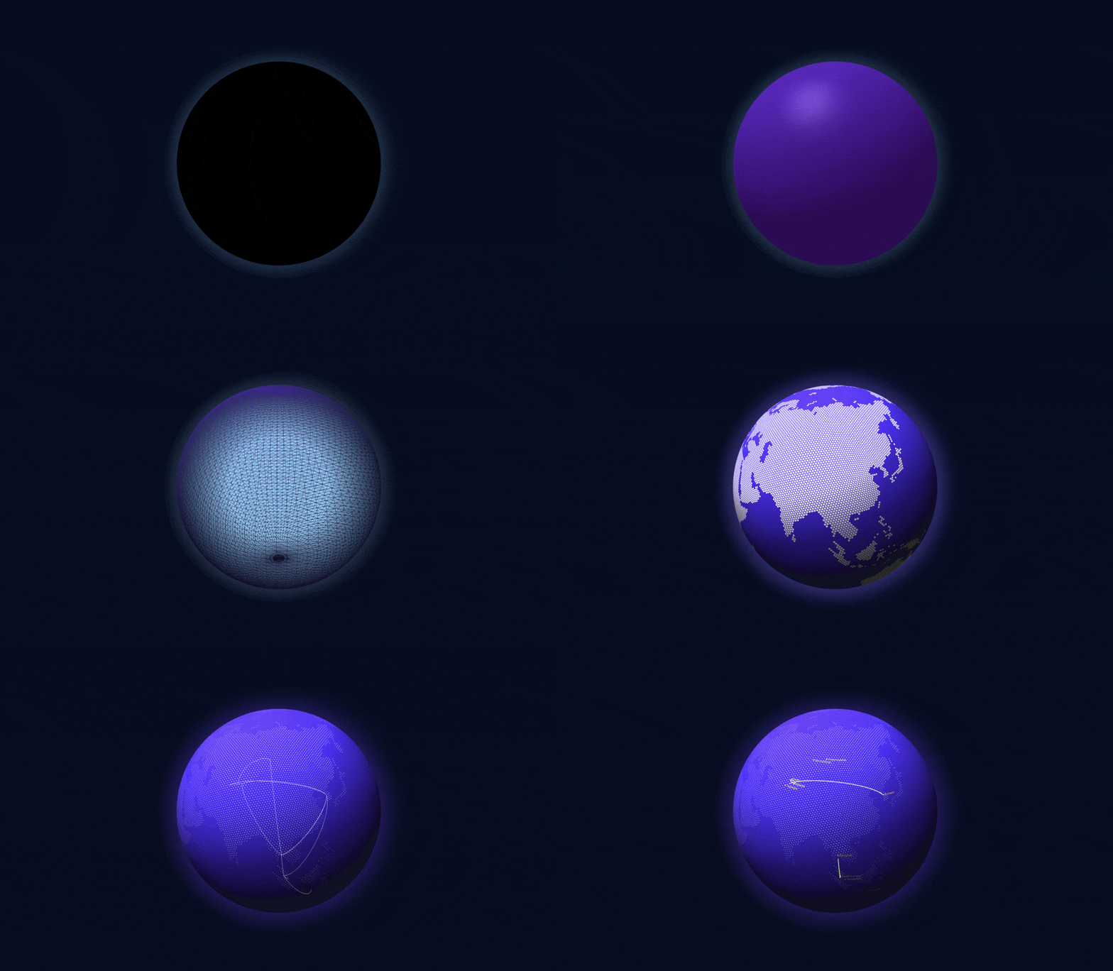
After doing a lot of testing with different light sources and types, I was able to replicate that dreamy space environment with 4 light sources. An AmbientLight gives the globe a very soft exposure by lighting up the scene. Then, a DirectionalLight, located above the globe, projects a strong, bright light on the upper hemisphere. More shading is added with two other, colored DirectionalLights.
Since the globe's material is MeshPhongMaterial, I had a lot of flexibility with it. I could adjust emmisive color and its emissiveIntensity, plus shininess of the surface.

Displaying my boarded flights from 2019-2020
The source code is available in janarosmonaliev/github-globe repository. I displayed all my flown flights from 2019-2020 on the globe. I downloaded my calendar from Google to retrieve my flights history. It looks cool, but there's a lot of things to work on.